Tuesday, 3 May 2011

7. Looking Back At Your Preliminary Task, What Do You Feel You Have Learnt In The Progression From It To The Full Product?

Looking back at your preliminary task, what do you feel you have learnt in the progression from it to the full product?
For my main product I really looked into my audience research and just general music magazine research to make sure that I was producing the right product that my target audience would want. Looking back at my preliminary task it is not targeted as well to the audience’s demands as it could potentially be. So I think that I have really improved my approach to audience research as I think it made a massive impact in my work and how I went about my product and what it should look like and be about.


I now understand that by using real magazine conventions it makes it seem more real and professional looking, for example, for my double page spread, I edited my image to make the models head appear over the top of the title of the page, this is seen in many real music magazines and therefore I think that it made my music magazine look more professional. Whereas looking back at my preliminary task it’s all very simple and not how I think it should look.


From my preliminary task you can see that I wasn’t as good in Photoshop and InDesign as I have now become, this is because over the course of my project I have been learning new things about new programmes/software. InDesign was a whole new programme for me and the difficulties I had with it were affecting my ability to complete my work but I soon learnt how to use it properly which impacted my work as it then progressed and looked a lot better and more professional. I knew how to use Photoshop already but by concentrating on certain elements it has improved my skill, for example, with using the magazine of convention of putting the masthead/title under the models head I had to manipulate the image in Photoshop and remove the white background and make it transparent.

 Using InDesign


Manipulating the image in Photoshop.


When deciding on my shoot to feature in my main task I wanted it to look much better than my images used in my preliminary task therefore I thought thoroughly about the location and theme I would use. I set up my shots to show what I wanted to show and I knew in my head how I visually wanted them to look like as I had done a lot of research into other magazines and looked at the shots they used for their front covers, contents pages and double page spreads. By thinking it all through and making sure I drew up mocks of the shots it helped me to create the music magazine I have thought of.
I have developed my critical evaluation skills as I would check over my work and evaluate each part as i went along and then get some feedback about my work. I also looked at other students work and would see what was a strength in their work which could influence my work and then also point out weaknesses which I would steer to avoid in my own work.

6. What Have You Learnt About Technologies From The Process Of Constructing This Product?

What have you learnt about technologies from the process of constructing this product?
I used the college’s dell computers for the majority of my work, which means I learnt how to use these computers software specifically throughout my project.

But I did also use my memory stick which then helped me to transfer my work from the college computers to my laptop at home.


I have an apple  Mac book so therefore I bought windows software to help me to continue with my work from college that id started in word or PowerPoint etc.


For my preliminary task I used my Samsung ST550 dual screen camera to take my photos which were then edited and put into my front cover and contents page.

For my main task I used my digital Canon SLR to ensure that my photos were top quality. By using this camera I was also able to control how the picture looked which helped with the editing that I later done before adding the images to my main task.

I used my Blackberry Bold 9700 to take photos of any drawings which I needed to show in my blog, I used my Blackberry as I don’t have access to a scanner.


I then used my mini SD memory card adaptor stick to transfer the images from my Blackberry mini SD memory card to the computer to enable me to add the images to my blog.

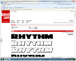
For my mastheads and most of the wording in my main task I used the website dafont.com to find a suitable font to suit my genre and layout of my music magazine.

Editing/manipulating my photos for both my preliminary and main task I used Adobe Photoshop CS4, I learnt many different ways of editing including dodging and burning the colours the make them brighter or darker and using brightness and contrast to make the picture more vibrant in colour. I also used the crop tool for my images in Photoshop to make my images the size I wanted.

I used Microsoft Office Outlook to keep up to date and organised with my work and keep in contact with my teachers informing me on things I needed to do within my work and sometimes i used it to email my work to home so i could use my home email and do my work at home.


I used a programme called Adobe InDesign to create my main task, this was a new programme to me and I found it difficult to use as I was unsure on how it worked, but I soon got used to it and started to understand what I needed to do and how to do it within the programme.  
When I need to print screen anything I used Paint and then saved it and added that image to my blog.


I used Microsoft Word for the majority of my work which I then copy and pasted into blogger.

I also used Microsoft PowerPoint for some of my work, especially flat plans and some audience research. I then copy and pasted this in to my blog or made a print screen in Paint.
I made a Blogger account which I used to present all my work. I learnt how to upload images and insert words into a blog and I think that it is a good way of showing my work as it makes everything clear and easy to read.


Thursday, 28 April 2011

5. How Did You Attract/Address Your Audience?

How did you attract/address your audience?
I attracted/addressed my audience by using my research into music magazines and the genre I selected for my own music magazine production, this helped me to chose the right use of language, images and layout etc.
I used a formal type of language as this is what is seen in most music magazines, by looking at different music magazines throughout my research this showed that the type of language varied from genre to genre, I then decided on a more formal approach on my use of language to appeal to everybody interested in my magazine.
I used a simplistic font for the main article of featured on my double page spread. This is because it is a common convention that the majority of my audience will be able to associate with. This is only seen in my main feed of relative research, ‘vibe’ magazine. Therefore I used a similar type of font for my music magazine article; I also made the first letter of my article bold the same as the ‘vibe’ magazine.


I decided on a similar font to ‘vibe’ for my masthead and titles across my music magazine production. This is because it is bold and stands out to the audience I was aiming to attract.


From my research on ‘vibe’ magazine and other music magazines, it showed that they based that edition of the magazine to the artist featured on the front cover, this meaning that they are the stars of the front cover, contents page and then there is an article about them on a double page spread. Therefore to attract my audience to my product I made the contents similar to other music magazines making it familiar to the audience, making it what they are used to. I made my music magazine about one band ‘girls affliction’ and then featured them across my entire music magazine, similar to what is usually seen in most music magazines.


The ideas I used for my images where to attract the audience visually. I noticed within my research that most music magazines show bright colours on the front cover, I think that this intrigues the audience into wanting to see what the product is about etc. I then took this convention from my research and used it within the images I took. I especially noticed that within ‘vibe’ magazine, there is usually a colour scheme present and is consistent throughout the product. This helped me to decide that I wanted a particular colour scheme that would be consistent throughout my product through the use of my images. Also, I wanted my images to have a fun, girly theme to appeal to female audience but the sex appeal of the images to attract male audiences. For example, the colours from the ‘Nicki Minaj’ issue, have a consistent bright colour theme throughout the images, this along with the sex appeal shown in her clothing and body language.


I used a big bold masthead in my music magazine production; this was to attract the audiences as it stands out and is clear to read. Using a large font, in bold, helps to catch the eye of the potential buyer of my music magazine product. My research of music magazines showed that most of them have fairly large and bold mastheads featured on their front covers, so to attract my audience I decided to follow that convention and use a bold black font against my white backgrounds.
I used a simplistic layout for my music magazine as it makes it appealing to the reader as it makes it easier to find main articles etc. This was the main aim for my contents page but also on my front page I wanted to make it informative but not give too much away so that they are intrigued to buy and then read my product.
My audience is based on male and female audiences, I done this by using a sex appeal within my images for the male audience and then the girly theme for female audiences. My initial research had a huge impact in the decisions I made in the production of my music magazine product, I use my research a lot to make sure I was making my product appealing to my audiences, I mimicked similar conventions from different music magazines to make my music magazine attractive to audiences.

Tuesday, 26 April 2011

4. Who Would Be The Audience Of Your Music Magazine?

Who would be the audience for your music magazine? 
I targeted my magazine to people who enjoy the music genre of hip-hip/RnB music. Through my audience research through ‘Find Your Tribe’ I came to the conclusion that the people I would be targeting would be ‘blingers’ as they named them, I thought that this would be a good target audience for my music magazine as it helps to contribute to the niche market of hip-hop/RnB music magazines, as there are currently a rare few including ‘Vibe’. The ‘blingers’ are seen to be high spending; glossy type people who I think would be the core buyer of my magazine.


I think that because of the sex appeal image of the hip-hop/RnB genre overall, there would be a higher percentage of males to females, however, females are not to be forgotten and men are also seen with a sex appeal in this genre, usually with their top off revealing their extremely toned torsos. The hip-hop/RnB genre originated from young afro-Caribbean Americans with their luxurious lifestyles and love of hip-hop/RnB music and bling. They like the top quality brands and the glossy image.
Their psychographic profiling can sometimes be seen in a negative light as they can be seen to be violence by carrying guns etc and dealing in illegal doings making them Strugglers. But overall most are involved in the music that they believe in and think of it as their dream to make it mainstream which therefore makes them a Succeeded/Explorer. This is the image that I would want to project onto the institutions that I wanted to distribute my music magazine. In my music magazine I would make it steer away from negative stereotypes of some aspects of the genre and glorify the positive luxurious lifestyle that they endure. I think that my audience would fall into the C2 socio-economic group as they would be average working class people wanting the lavish lifestyle that their role models live and they would be looking up to follow their role models as part of their dream of success.

3. What Kind Of Media Institution Might Distribute Your Music Magazine And Why?

What kind of media institution might distribute your music magazine and why? 

I think that the magazine institution IPC would be a suitable institution to distribute my music magazine, they currently publish music magazines such as NME and I think that my music magazine would fit in nicely into their portfolio as my music magazine targets a popular, ‘blinger’ style audience.


Another magazine institution BAUER would also be a suitable institution to distribute my music magazine as it currently produces music magazines such as Q  magazine which is a popular music magazine targeting a mixture of audiences.


My music magazine would be seen as more of a niche market as it is not widely available as there is only one main hip-hip/RnB music magazine being ‘Vibe’ magazine. So I definitely think that there would be a gap in the market for my product to be in. I think if either of the institutions distributed my music magazine it would definitely be something different for them, however, BAUER, already offers a variety of music magazines in its production which offers a variety of choices of music genre to its audiences.  This therefore means that BAUER has more experience in distributing a variety of genres where as IPC only offers one music magazine which includes more of a rock/alternative genre of music. I think that the institution EMAP would not distribute my music magazine as it specialises in business magazines which does not relate to my music magazine so therefore they would not distribute it.


Thursday, 7 April 2011

2. How Does Your Music Magazine Represent Particular Social Groups?

How does your music magazine represent particular social groups?
In my product I tried to make my social group that I represented appeal to my genre audience. As I chose for my music magazine to be a hip-hop/RnB magazine I tried to make my models look more like ‘blingers’. ‘Blingers’ are a social group that listen to hip-hop/RnB music and like expensive clothing and jewellery, ‘bling’. By creating a girly mise en scene to my images this created a fantasy like theme which is seen in other hip-hop/RnB music magazines such as ‘vibe’, also by using the props of lollipops, fluffy pillows and dresses further created my mise en scene. I based this on the front cover of ‘vibe’ magazine with the artist Nicki Minaj on the cover with an animated background and a fantasy feel.


By dressing my models in short, tight dresses I made them represent ‘blingers’ by looking at my research of ‘vibe’ magazine I could see that the female artists featured on the pages were showing a lot of skin from their costumes, mainly their legs, therefore I decided to show this in my products to show the same sex appeal as in my researched music magazines.


I used a bright lighting in the studio to make the images bright and the background a plain white, I done this to make the colours stand out more and to also make the images look ‘glossy’ this was to represent how ‘blingers’ are seen in actual hip-hop/RnB music magazines. By using the studio, I was able to create my desired light effect, I researched into some ‘vibe’ magazine images from shoots from the animated type article from the cover and this helped me to decide on the lighting I wanted and that I wanted to use a studio to achieve more ‘glossy’ looking images seen in hip-hop/RnB music magazines.


I used quite simplistic language throughout my product as it related to the research I had done on ‘vibe’, they base their product on the main image and less writing. I also made my language very straight to the point not to confuse my audience in any way.
I made my models relax in their photo shoot to make their expressions slightly more natural than the ones seen in ‘vibe’, however I still based my images on the poses and expressions seen in ‘vibe’ just less forced. I used girly, genuine poses and body languages but including the sex appeal and the fun theme that I decided to use through my research.


In my image used for my double page spread there is slight attitude present in the model on the lefts face, this is seen a lot in hip-hop/RnB music magazines such as ‘vibe’. I think it’s an important part of the representation of the ‘blingers’ as a social group as they are seen to have an attitude in images of them. 


Thursday, 31 March 2011

1. In what ways does your music magazine use, develop or challenge forms and conventions of real music magazines?

In what ways does your music magazine use, develop or challenge forms and conventions of real music magazines?
My choice of masthead was based on my music magazine front cover research, most of the magazines I researched show the masthead to be behind the image/model. So to make my music magazine conventional I developed from my research and edited my image by taking away the white background to enable me to put my masthead behind my models head in my image for my magazine double page spread. For my other mastheads on the front cover and contents page, I didn’t do this, I decided on making the mastheads stand out over the image to make sure the titles were clearly seen to my audience.
I decided to use the photography studio for my location to give me the guarantee of perfect lighting. Using the studio I was able to set my lighting up to make the background as white as possible which therefore meant my images looked glossy like a music magazine image. This helped for me to show the hip-hop/RnB genre of my magazine by showing the shiny white/’bling’ style side of the genre. I decided that by using the studio and getting the lighting perfect would be the best way to guarantee I got the shiny white ‘glossy’ images that I wanted.  Through my research I noticed that the front cover, contents page and double page spread of ‘vibe’ magazine show glossy, well taken, seductive photos. Looking at my research of vibe magazine, which is a hip-hop/RnB genre magazine I was able to get a feel of the kind of images I wanted, I wanted to show sex appeal but also a girly playful side to my artists featured in my music magazine, by creating them to have sex appeal and a playful girly side this allows my magazine to appeal to male and female audiences. By using this within my images I’ve made them attractive to my audience. For my final images I used an image that was a medium shot for my front cover, this was to show the faces of my artists and to intrigue my audience into my music magazine, an image that was a long shot for my contents page, this provides the sex appeal to my music magazine, attracting the male audiences and a wide medium shot for my double page spread, this was also part of the sex appeal but also shows the playful side for female audiences. I manipulated my images in Adobe Photoshop CS4 to bring out the colours and wide away any imperfections to the models and their surroundings, but using the dodge tool I was able to make the background even whiter to ensure the glossy feel for my image. I was attempting more to follow the convention rather than challenge it, my reason for this being, i wanted my music magazine product to be appealing to a certain audience, so by looking at similar products of the same genre through my research this enlightened me on how my images should look and what vibe they should give off to the audience.
My costumes represented a unity as a band that I had created but within my article for my double page spread I made it more apparent about their separate personalities. For the costumes I chose two skin tight ‘bodycon’ dresses which were the same but in different colours, this was for the sex appeal of my images, through my research of vibe magazine it was very apparent that the artists would be wearing short clothing showing as much skin as possible, this is how I related my costumes to my genre. For my props I used a variety of dresses to cover the floor, I then placed lollipops on top of them I placed bright colourful lollipops and then the main prop I used was pillows. I used these props to create a playful, fun vibe to my shoot, appealing the female audience of my music magazine. My main prop being the pillows set the theme for my shoot of a ‘pillow fight’ this gave my shoot more character. In my research the front cover of ‘vibe’ magazine showed the artist Nicki Minaj in brightly coloured clothing and animated characters around her, this is where my initial idea for my shoot came from, basing my shoot on this same genre music magazine helped me to create the theme for my shoot, so therefore I followed the conventions of the same genre music magazine to mine.
I chose to use two girls to create my band for my music magazine, through my research of music magazines, the magazine ‘vibe’ showed mainly women on their front covers, contents pages and double page spreads. I used young females to attract the younger hip-hop and RnB audience that my magazine it aiming to appeal to.
Choosing my font took a considerable amount of time, I wanted it to be modern and look good with my images but also be clearly seen and stand out to potential consumers of my product. I decided on a bold font in black with a white line running through it, my text saved with a white background to it, which when added to the image, I liked the way it looked. I used a website called ‘DaFont’ to help me to find the perfect font for my product. I used the same font throughout each individual task of the front cover, contents page and the double page spread; this was to keep to style and genre of the product going throughout each of them. I think the font has a positive impact onto the product making it stand out and look different to other music magazines.



I chose to use a standard style of English, using a formal wording making it assessable to many different audiences. This reflects the magazine to being higher end with well spoken readers, the music can be seen more as informal with informal language within the genre of music, but the magazine would be seen to be glamorising it. Within my text i used repeated phrases such as ‘new gossip’ and ‘new music’ which is appealing to a younger audience. But within my double page spread article I used more of a journalistic type of tone and spoke more to the audience in a kind of knowledgeable way informing them about this new band rather than talking informally about the genre and the artist in general.
I think the genre of my magazine is mainly reflected in the name of my product, ‘rhythm’. In hip-hop and RnB music, rhythm is a main part. Also my genre is reflected in the images I used and the style in which I took them.  The types of bright colours I used which I decided through my research would look appropriate to my genre.
For the layout of my front cover I used an image to cover the whole space making the image fill the page. The balance of text and image is slightly out of proportion as I chose not to have too much text on my front cover, similar to the music magazine I researched ‘NME’, I decided to do this as I think it gives the magazine some mystery tempting the readers to buy and read it, but I still wanted to mention what is inside without giving it all away. For my front cover I decided to just mainly use the name of the music magazine ‘RHYTHM’ and the main articles to attract my audience. As my selected font is bold and black it stands out against the white background I used. I used a more of an action shot like the image used in one of the music magazines I researched called ‘Rolling Stone’, that magazine was a tribute to Michael Jackson showing him dancing on the front cover, I wanted to use this on my magazine to bring it to life. By doing this I challenged more of the conventional approach of hip-hop/RnB genre magazines to use more forced images, I still took the convention from hip-hop/RnB genre magazine ‘vibe’ to use sex appeal within my images though to appeal to male audiences.
For the layout of my contents page I used a more simplistic style like my researched music magazine ‘vibe’. I decided to use a single image like ‘vibe’ instead of a variety of images like some of the other music magazines I researched, I think this gives the contents page more organised and easily accessible to the reader, whereas too many images can become confusing. This is the same reason I didn’t use too much text, I used limited text to make my product more accessible to my readers. For my contents page I think the balance between image and text is equal, there’s only one image and little text. I used the conventions similar to ‘vibe’ magazine this was to make my product similar to a actual hip-hop/RnB genre music magazine, this was why I used little text making my music magazine easily accessible by my audience and only used on image containing an innocent sex appeal appealing to both female and male audiences, I used this image because of the image used in ‘vibe’ magazines contents page which shows a lot of skin and is ‘sexy’, so that’s a convention I used in my contents page production.
For the layout of my double page spread I used an image to spread across both pages, but I decided for the image to be blank on one side similar to the ones I saw in my double page research in ‘Q’ and ‘NME’ music magazines.  I also put my image on top of the text, this is a convention used in ‘NME’ music magazine. I did this to make the images stand out further. I think the balance between images and text is equal as I used a large image and then wrote an article about my artists. This is a convention that I saw in most of my research, the image being large and to one side, also the text being in columns is another convention I found in most of my researched music magazines, therefore I decided to use them both in my double page spread production. I made my image large and put my text into columns, the purpose of this was to make it similar to other music magazines making it appealing to my audience.
Overall, I have challenged and followed my research music magazine conventions; I challenged them by making some changes to what you would usually see in a hip-hop/RnB genre music magazine but also followed conventions such as text layout (columns) and image sizes to make it seem to be a real music magazine. I done this to appeal to my audiences but also to appeal to a wider variety of audiences by giving them something they know and something different at the same time to satisfy expectations of new audiences.